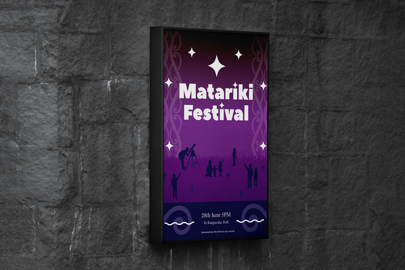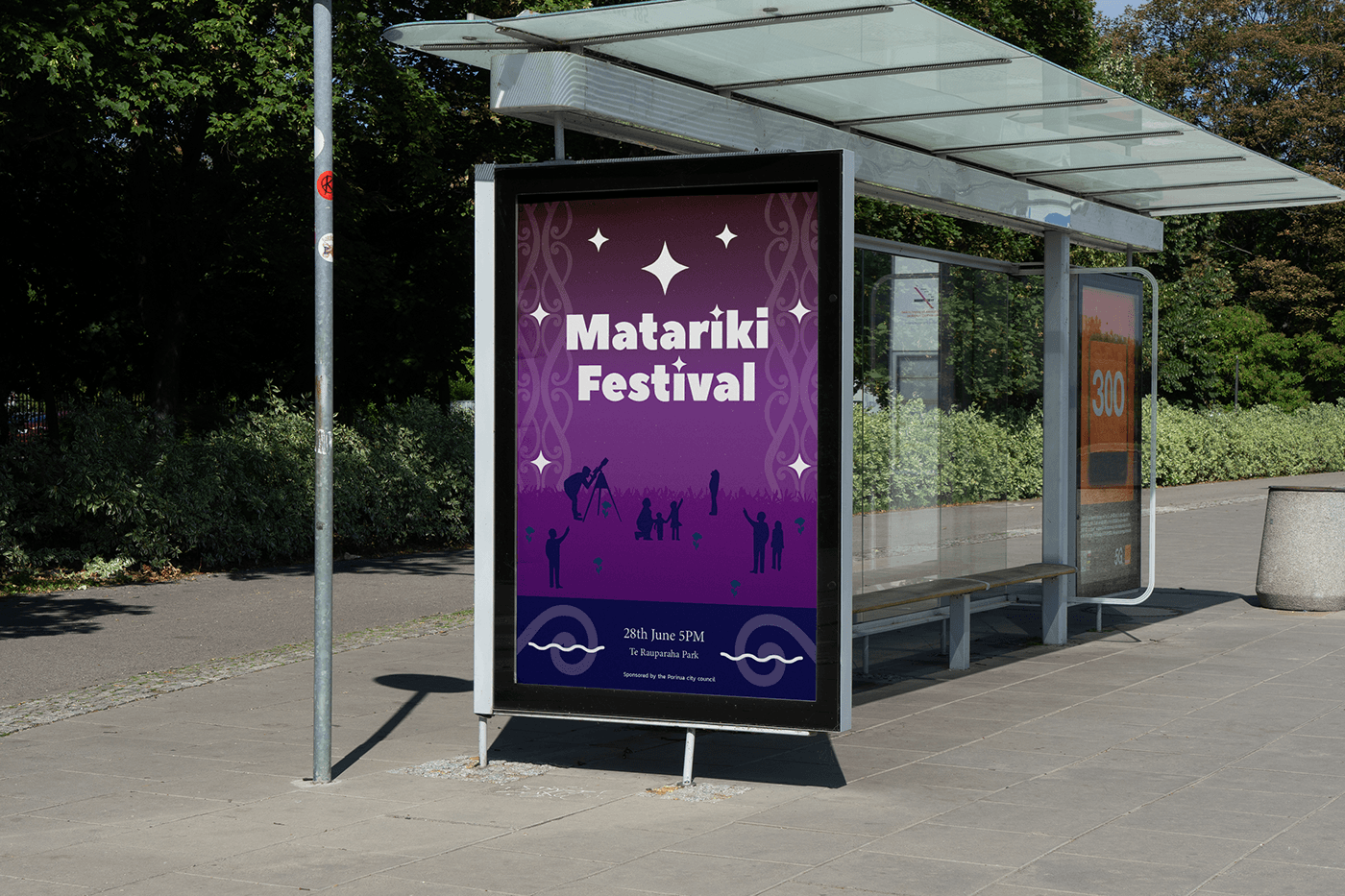
My Matariki poster was designed for my level 4 creative media class as part of an assessment targeting Maori and Pakeha families living in New Zealand, specifically focusing on parents who would likely attend with their children.

To capture the attention of my audience, I drew inspiration from familiar advertisements known for their bold text and vibrant gradients. These elements were incorporated into my final design to create a visually appealing and attention-grabbing layout.
In an effort to emphasize the Maori celebration, I included traditional Maori patterns subtly faded into the background. These patterns hold significance, representing favorable times, generosity, and hospitality, key aspects of the Matariki event. I strategically placed these patterns to frame the text, enhancing its visual impact.
In terms of colors, I carefully selected a palette inspired by the essence of Matariki. Deep blues, purples, and celestial tones were chosen to evoke the celestial significance of the event and create an atmosphere of cultural reverence.
Overall, my goal was to create a poster that not only visually engages the audience but also respectfully honors the cultural significance of Matariki while attracting families to participate in the celebration.
I crafted this poster by meticulously outlining my target audience and creating personas. My process involved thorough research on Matariki, delving into its significance, timing, and exploring various Maori patterns for potential inclusion.
I initiated the design phase by sketching multiple concepts, seeking feedback from classmates to gauge their preferences. After finalizing the favored concept, I translated it into Adobe Illustrator, bringing the chosen design to life. And voila, the poster was created!